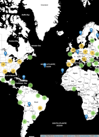
A few weeks back the CGI and I were approached by Miguel Nacenta from SACHI about putting together an infographic for an article on FatFonts (also see my previous article) to be featured on the Wired (UK) magazine website. Since Wired is one of my favourite magazines, I jumped at the chance! Using data that Dr Timothy Stojanovic and I are working with as part of Tim’s work linking off-shore cumulative human impacts to on-shore terrestrial urbanization, I put together several infographics depicting human impacts on the oceans surrounding Edinburgh and London. One of these graphics was selected for the article, which is now available online. So go check out the article, and click on “View Gallery” to check out my infographic, along with several cool images from Miguel Nacenta, Uta Hinrichs, and Sheelagh Carpendale!
The infographic in the article doesn’t have a title or legend per se, so I’m going to create an amended version soon with an explanation of what the values represent, and a bit of context to the data and what we are hoping to show with it. So stayed tuned for updates!