In celebration of St Patrick’s day last week, I decided to dig up an old dataset from when I was living/working in Ireland on historical Irish populations by county, and have a play with D3js and cartograms. Click here to view it ‘live’. If you’ve read any of my previous posts, you’ll know that I like cartograms as a useful and fun way to visualize data. The Great Famine was an important and significant event in Irish (and global) history, and cartograms provide a fun and informative way to explore the resultant population change in Ireland ...
- Fri 28 March 2014 cfarmer
ftools is dead… long live ftools!
Tue 15 October 2013 cfarmerI recently decided to drop
ftools.ca, since I hadn’t updated it in a very long time, and it was really just costing me money to keep a ‘dead’ website up and running. Additionally, with the new QGIS plugin infrastructure, hosting my own plugins (the website’s primary purpose) was no longer needed. The site has served me well for many years, and really helped get fTools (the plugin) into the QGIS core codebase. The website has served its purpose, and now that I have very little involvement with fTools and the QGIS Processing Toolbox that is poised to replace it, I’m moving on:ftools.cais dead, long liveftools.ca!However, now that QGIS 2.0 has rolled out, it seems that at least one part of ftools.ca is missed: my old cartogram plugin. If I have some spare time, I’ll try to update the plugin to the latest and greatest QGIS 2.0 standards and upload it to the new QGIS plugins system. In the mean time, for those out there who would like to use it right away, you can get the original code from here or grab it from github. In fact, if someone is able and willing, they can grab the code from github, update it for QGIS 2.0, and submit a pull request which I will (more than likely) happily accept.
cartogram updates
Fri 10 August 2012 cfarmerIt seems my Olympic medals cartogram is getting a bit more attention (Guardian data blog, and Telegraph data and graphics blog), so I’ve updated a few things and wanted to highlight/explain them a bit here.
Firstly, you can now explore the medal data together with population and GDP as well as without any warping to get a feel for how much things change. Secondly, in order to be able to display the map in a way that is familiar to most people (i.e., landscape style), I had to take a few liberties in terms of representation. For ...
Olympic cartogram
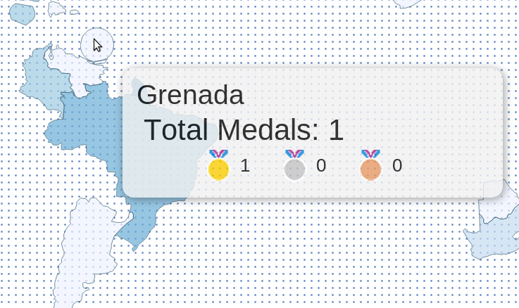
Thu 02 August 2012 cfarmerThe London 2012 Summer Olympics have generated quite a bit of buzz in terms of Visualizations and interesting data analysis. In fact, news sites here in the UK are doing all sorts of cools things with Olympic data, and The Guardian has an entire series devoted to Olympic data. A colleague of mine also pointed out a cool graphic on The Telegraph website, which is essentially a live cartogram of Olympic medal counts. The cartogram is basically a spatial bubble plot, with the size of the bubbles representing the number of medals obtained by each country. The location of each bubbled is based on the corresponding country’s approximate geographic location. The graphic is pretty effective, and it certainly tells a clear story.
I’m a big fan of these types of abstract representations of space, so I thought The Telegraph’s graphic was pretty fun. Having said that, I’m always a sucker for a more ‘traditional’ rubber-sheet cartogram, which is generally less abstract than a bubble plot, but can sometimes lead to dramatic results. Since I felt like the only person on the internet without their own Olympics Visualization, I decided to throw together a cartogram to visualize Olympic medal achievements. Drawing inspiration from The Telegraph graphic, I created a rubber-sheet cartogram based on an iterative warping method. The ‘live’ version of the cartogram is available here (or by clicking on the image below). [UPDATE] If you’d like to include the map on a web page, you can now do that by including this in your HTML source:
<iframe src="http://www.carsonfarmer.com/examples/olympic_countries/map.html" width=1230 height=545\></iframe>
1 / 1

