Thu 02 August 2012
cfarmer
The London 2012 Summer Olympics have generated quite a bit of buzz in
terms of Visualizations and interesting data analysis. In fact, news
sites here in the UK are doing all sorts of cools things with Olympic
data, and The Guardian has an entire series devoted to Olympic
data. A colleague of mine also pointed out a cool graphic on The
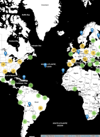
Telegraph website, which is essentially a live cartogram of Olympic
medal counts. The cartogram is basically a spatial bubble plot, with the
size of the bubbles representing the number of medals obtained by each
country. The location of each bubbled is based on the corresponding
country’s approximate geographic location. The graphic is pretty
effective, and it certainly tells a clear story.
I’m a big fan of these types of abstract representations of space,
so I thought The Telegraph’s graphic was pretty fun. Having said that,
I’m always a sucker for a more ‘traditional’ rubber-sheet cartogram,
which is generally less abstract than a bubble plot, but can sometimes
lead to dramatic results. Since I felt like the only person on the
internet without their own Olympics Visualization, I decided to throw
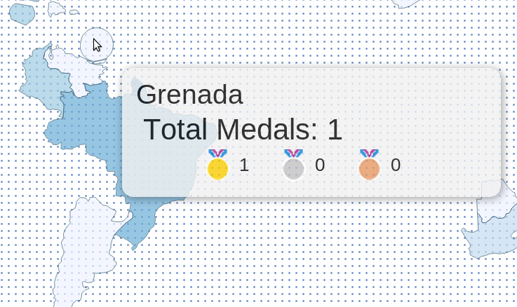
together a cartogram to visualize Olympic medal achievements. Drawing
inspiration from The Telegraph graphic, I created a rubber-sheet
cartogram based on an iterative warping method. The ‘live’ version
of the cartogram is available here (or by clicking on the image
below). [UPDATE] If you’d like to include the map on a web page, you can
now do that by including this in your HTML source:
<iframe src="http://www.carsonfarmer.com/examples/olympic_countries/map.html" width=1230 height=545\></iframe>
read more
comments

