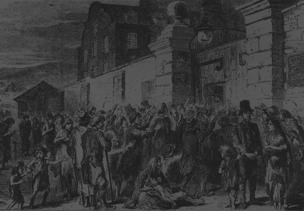

This is a simple visualization of population change in Ireland during the Great Famine era. It uses continuous area cartograms and population estimates from 1841 to 2001 to demonstrate change. The cool thing about this visualization is how dramatically it emphasizes population loss from 1841 to 1851 (and beyond), and how, even in modern Ireland, many counties remain well below their pre-famine population levels. As a whole, the population of Ireland remains less than 70% of its pre-famine levels!
A popover gives you additional information on mouse over. This includes county name, total population for the give year, and a nice little sparkline showing population change over time (with the current year highlighted for reference). This gives a nice quick feel for the population change over time, and was pretty easy to do using D3js and Twitter Bootstrap.
This visualization uses D3js, colorbrewer, Twitter’s Bootstrap, jQuery, and some helpful examples from here, here, and here (among others). There is also a segmentized topology, which distorts the shapes a bit more fluidly than the original.
Code based heavily on the d3-cartogram example by Shawn Allen at Stamen.