In celebration of St Patrick’s day last week, I decided to dig up an old dataset from when I was living/working in Ireland on historical Irish populations by county, and have a play with D3js and cartograms. Click here to view it ‘live’. If you’ve read any of my previous posts, you’ll know that I like cartograms as a useful and fun way to visualize data. The Great Famine was an important and significant event in Irish (and global) history, and cartograms provide a fun and informative way to explore the resultant population change in Ireland ...
- Fri 28 March 2014 cfarmer
Research dissemination and interactive visuals
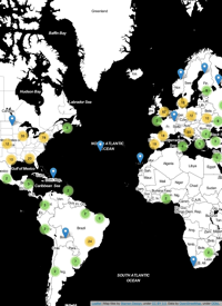
Tue 10 April 2012 cfarmerOne of my goals for this year is to spend more time and effort developing effective Visualizations for my various research projects, in an effort to make my research more accessible to others. This is one thing that I think many academics are particularly bad at: letting others know what they are up to, and why it might be something worth looking at. In order to avoid this pitfall, I plan to focus on producing interactive, web-based visuals suitable for a more general audience in addition to more traditional forms of research dissemination such as journals and conference papers. It is my hope that by doing this, I will be making my research more readily available to those who might actually be able to use it, and maybe even create some compelling Visualizations in the process. While I’m not quite ready to start creating full-blown interactive websites yet, I thought it might be a good idea to start with something small to get the ball rolling; so I put together an upgraded version of my previous map of visitors to www.carsonfarmer.com.
1 / 1
