With the recent (and long anticipated) release of Quantum GIS 2.0, there has been a lot of ‘buzz’ in the open source geospatial community about all the cool new features that QGIS now boasts, and how far it has come in such a short time. I was recently inspired by such a post by Anita Graser (aka Underdark) (who is a wonderfully talented cartographer/designer) on data driven labeling in QGIS, so I thought I’d throw something together on a gray Friday afternoon to test it out. I also wanted an excuse to play around with Reveal.js slides in IPython notebook, so I produced the following slide show using the images from QGIS and some IPython magic:
- Fri 27 September 2013 cfarmer
Research dissemination and interactive visuals
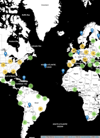
Tue 10 April 2012 cfarmerOne of my goals for this year is to spend more time and effort developing effective Visualizations for my various research projects, in an effort to make my research more accessible to others. This is one thing that I think many academics are particularly bad at: letting others know what they are up to, and why it might be something worth looking at. In order to avoid this pitfall, I plan to focus on producing interactive, web-based visuals suitable for a more general audience in addition to more traditional forms of research dissemination such as journals and conference papers. It is my hope that by doing this, I will be making my research more readily available to those who might actually be able to use it, and maybe even create some compelling Visualizations in the process. While I’m not quite ready to start creating full-blown interactive websites yet, I thought it might be a good idea to start with something small to get the ball rolling; so I put together an upgraded version of my previous map of visitors to www.carsonfarmer.com.
Because its fun to map stuff…
Fri 30 March 2012 cfarmerIts been quite a while since my last post, and its Friday and I was feeling creative, so I decided to map something! I’ve been looking for an excuse to produce a nice graphic like the one Anita Graser created to represent Vienna’s green-spaces. She used Quantum GIS to produce a hexagonal grid for representing the density of Viennese trees instead of the standard heat map or kernel density map, and the results are quite nice! I’m a huge fan of QGIS, but I tend to do most of my work in R, so I decided to ...
1 / 1
