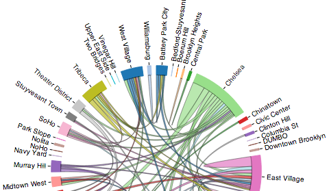
I recently attended the April 2014 #BetaNYC (#BikeNYC) @CitiBikeNYC Hacknight, and after seeing several interesting presentations on what people are doing, want to be doing, and are thinking of doing with the recently released Citi Bike Trip Histories, I was inspired. A few of us got together to ‘quickly’ and ‘easily’ hack together a Sankey diagram of the bike trip flows… Turns out this wasn’t nearly as quick and easy as we though: By the end of the evening, we were still struggling with getting D3js‘s Sankey plugin to play nicely with our data (which I was manipulating ...
- Wed 07 May 2014 cfarmer
After the Irish Famine: Population Change in Cartograms
Fri 28 March 2014 cfarmerIn celebration of St Patrick’s day last week, I decided to dig up an old dataset from when I was living/working in Ireland on historical Irish populations by county, and have a play with D3js and cartograms. Click here to view it ‘live’. If you’ve read any of my previous posts, you’ll know that I like cartograms as a useful and fun way to visualize data. The Great Famine was an important and significant event in Irish (and global) history, and cartograms provide a fun and informative way to explore the resultant population change in Ireland ...
Public transportation time warp
Tue 01 October 2013 cfarmerI recently came across two extremely cool videos while preparing lectures for my transportation geography course. It is pretty cool to see the development of the regions around the transportation network while the network itself remains pretty much unchanged. Worth a quick watch!
The first video depicts the London to Brighton Train Journey for three time periods. In 1953, the BBC made a point-of-view film from a London to Brighton train, 30 years later (1983) they did the same trip again, and again 30 years after that (2013).
The second video is from the Vancouver SkyTrain, with older footage (1985) from BCRTC/Translink, and newer footage (2013) by Celgen Studios. You can get the original Translink footage from here.
Maps as Art and Other Experiments
Fri 27 September 2013 cfarmerWith the recent (and long anticipated) release of Quantum GIS 2.0, there has been a lot of ‘buzz’ in the open source geospatial community about all the cool new features that QGIS now boasts, and how far it has come in such a short time. I was recently inspired by such a post by Anita Graser (aka Underdark) (who is a wonderfully talented cartographer/designer) on data driven labeling in QGIS, so I thought I’d throw something together on a gray Friday afternoon to test it out. I also wanted an excuse to play around with Reveal.js slides in IPython notebook, so I produced the following slide show using the images from QGIS and some IPython magic:
cartogram updates
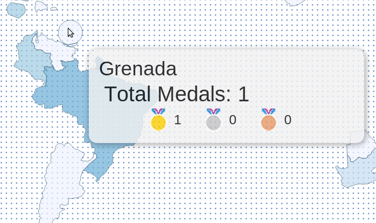
Fri 10 August 2012 cfarmerIt seems my Olympic medals cartogram is getting a bit more attention (Guardian data blog, and Telegraph data and graphics blog), so I’ve updated a few things and wanted to highlight/explain them a bit here.
Firstly, you can now explore the medal data together with population and GDP as well as without any warping to get a feel for how much things change. Secondly, in order to be able to display the map in a way that is familiar to most people (i.e., landscape style), I had to take a few liberties in terms of representation. For ...
Olympic cartogram
Thu 02 August 2012 cfarmerThe London 2012 Summer Olympics have generated quite a bit of buzz in terms of Visualizations and interesting data analysis. In fact, news sites here in the UK are doing all sorts of cools things with Olympic data, and The Guardian has an entire series devoted to Olympic data. A colleague of mine also pointed out a cool graphic on The Telegraph website, which is essentially a live cartogram of Olympic medal counts. The cartogram is basically a spatial bubble plot, with the size of the bubbles representing the number of medals obtained by each country. The location of each bubbled is based on the corresponding country’s approximate geographic location. The graphic is pretty effective, and it certainly tells a clear story.
I’m a big fan of these types of abstract representations of space, so I thought The Telegraph’s graphic was pretty fun. Having said that, I’m always a sucker for a more ‘traditional’ rubber-sheet cartogram, which is generally less abstract than a bubble plot, but can sometimes lead to dramatic results. Since I felt like the only person on the internet without their own Olympics Visualization, I decided to throw together a cartogram to visualize Olympic medal achievements. Drawing inspiration from The Telegraph graphic, I created a rubber-sheet cartogram based on an iterative warping method. The ‘live’ version of the cartogram is available here (or by clicking on the image below). [UPDATE] If you’d like to include the map on a web page, you can now do that by including this in your HTML source:
<iframe src="http://www.carsonfarmer.com/examples/olympic_countries/map.html" width=1230 height=545\></iframe>
Visualization featured on wired.co.uk
Tue 29 May 2012 cfarmerA few weeks back the CGI and I were approached by Miguel Nacenta from SACHI about putting together an infographic for an article on FatFonts (also see my previous article) to be featured on the Wired (UK) magazine website. Since Wired is one of my favourite magazines, I jumped at the chance! Using data that Dr Timothy Stojanovic and I are working with as part of Tim’s work linking off-shore cumulative human impacts to on-shore terrestrial urbanization, I put together several infographics depicting human impacts on the oceans surrounding Edinburgh and London. One of these graphics was selected for ...
Research dissemination and interactive visuals
Tue 10 April 2012 cfarmerOne of my goals for this year is to spend more time and effort developing effective Visualizations for my various research projects, in an effort to make my research more accessible to others. This is one thing that I think many academics are particularly bad at: letting others know what they are up to, and why it might be something worth looking at. In order to avoid this pitfall, I plan to focus on producing interactive, web-based visuals suitable for a more general audience in addition to more traditional forms of research dissemination such as journals and conference papers. It is my hope that by doing this, I will be making my research more readily available to those who might actually be able to use it, and maybe even create some compelling Visualizations in the process. While I’m not quite ready to start creating full-blown interactive websites yet, I thought it might be a good idea to start with something small to get the ball rolling; so I put together an upgraded version of my previous map of visitors to www.carsonfarmer.com.
1 / 1


