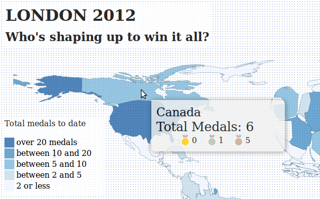
The London 2012 Summer Olympics have generated quite a bit of buzz in terms of Visualizations and interesting data analysis. In fact, news sites here in the UK are doing all sorts of cools things with Olympic data, and The Guardian has an entire series devoted to Olympic data. A colleague of mine also pointed out a cool graphic on The Telegraph website, which is essentially a live cartogram of Olympic medal counts. The cartogram is basically a spatial bubble plot, with the size of the bubbles representing the number of medals obtained by each country. The location of each bubbled is based on the corresponding country’s approximate geographic location. The graphic is pretty effective, and it certainly tells a clear story.
I’m a big fan of these types of abstract representations of space, so I thought The Telegraph’s graphic was pretty fun. Having said that, I’m always a sucker for a more ‘traditional’ rubber-sheet cartogram, which is generally less abstract than a bubble plot, but can sometimes lead to dramatic results. Since I felt like the only person on the internet without their own Olympics Visualization, I decided to throw together a cartogram to visualize Olympic medal achievements. Drawing inspiration from The Telegraph graphic, I created a rubber-sheet cartogram based on an iterative warping method. The ‘live’ version of the cartogram is available here (or by clicking on the image below). [UPDATE] If you’d like to include the map on a web page, you can now do that by including this in your HTML source:
<iframe src="http://www.carsonfarmer.com/examples/olympic_countries/map.html" width=1230 height=545\></iframe>
The cartgram is interactive, and was created using Python (pandas, ujson, and shapely) and D3.js. If I get a chance, I’ll try to post the code at some stage. In the mean time, here is a bit more info about the graphic:
The size of each country is based on the total number of medals that they have achieved, weighted by the type of medal (gold, silver, bronze). For example, a country with one gold medal should be approximately the same size as a country with three bronze medals. Because the algorithm attempts to maintain the topological relationships between countries, this relationship might not be perfect, but the general trend is clear: the US and China and cleaning up! [UPDATE] I’ve also added relative per capita medal counts and counts by GDP, which shrinks China down significantly… now who’s winning ‘big’?!
I don’t have full access to the server that this website is running on,
so I couldn’t get things set up with regular updates, however, the
entire process is now automated, so I’ll try to have the code run at
fairly regular intervals so that the results are relatively up-to-date
I now have the maps updating every hour. In any case, have a play around
and let me know what you think, and if you know of any other cool
Olympics graphics or cool applications of cartograms, please let me know
in the comments!

