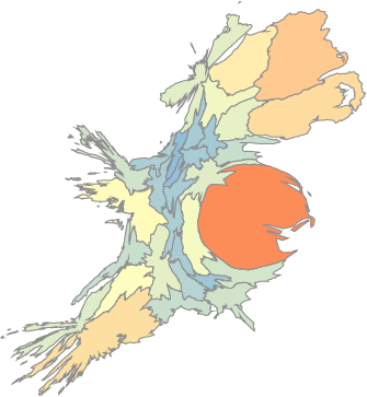
In celebration of St Patrick’s day last week, I decided to dig up an old dataset from when I was living/working in Ireland on historical Irish populations by county, and have a play with D3js and cartograms. Click here to view it ‘live’. If you’ve read any of my previous posts, you’ll know that I like cartograms as a useful and fun way to visualize data. The Great Famine was an important and significant event in Irish (and global) history, and cartograms provide a fun and informative way to explore the resultant population change in Ireland from around the Famine era (and beyond).
The cartogram ‘time-series’ provides a simple visualization of population change in Ireland after the Famine era. It uses continuous area cartograms and population estimates from 1841 to 2001 to demonstrate change. The cool thing about this visualization is how dramatically it emphasizes population loss from 1841 to 1851 (and beyond), and how, even in modern Ireland, many counties remain well below their pre-famine population levels. As a whole, the population of Ireland remains less than 70% of its pre-famine levels!
I’ve added a few nice interactive features to the map, including a popover feature that gives you additional information on mouse over. This includes county name, total population for the give year, and a nice little sparkline showing population change over time (with the current year highlighted for reference). This gives you a quick feel for the population change over time, and was pretty easy to do using D3js and Twitter Bootstrap.
To produce the visualization, I leaned heavily on D3js, colorbrewer, Twitter’s Bootstrap, jQuery, and some helpful examples from here, here, and here (among others). The code is based on the d3-cartogram example by Shawn Allen at Stamen.

