It seems my Olympic medals cartogram is getting a bit more attention (Guardian data blog, and Telegraph data and graphics blog), so I’ve updated a few things and wanted to highlight/explain them a bit here.
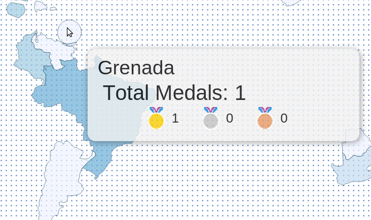
Firstly, you can now explore the medal data together with population and GDP as well as without any warping to get a feel for how much things change. Secondly, in order to be able to display the map in a way that is familiar to most people (i.e., landscape style), I had to take a few liberties in terms of representation. For instance, the ‘projection’ used is not area preserving (in fact, it is just the geographical coordinates), so some countries appear larger (smaller) than they should, even with the warping. We all make compromises though right? Third, because I wasn’t happy with adding artificial medal counts to make my algorithm happy, I decided to create a more ‘realistic’ graphic, so this time around, countries with zero medals have zero area (i.e. are removed). Related to this, because Grenada only has about 110,821 people, its per capita medal ranking is off the charts (note that I’m not using the the http://www.medalspercapita.com/ figures for the graphic)! This, coupled with its tiny size, means that my cartogram algorithm emphasises Grenada at the expense of all the other countries, making the graphic pretty boring unless you live in Grenada. As a result, I’ve excluded all countries with less than two medals in total (I know, I’m sorry, but it had to be done). Having said that, if you click to view the ‘normal’ map, then all countries are added back, and you get medal counts for all of them.

